
Apps
Oncepik: Explore the Platform Changing Online Sharing

Introduction
Oncepik is an online sharing platform that lets users upload, store, and share their digital files securely. It’s available in both free and paid versions, with each tier offering different storage and sharing limits. The platform uses encryption to keep files safe, making it a trusted choice for individuals, creators, and teams. If you’ve ever struggled to send large media files or manage digital content neatly, Oncepik is built for that exact problem.
It gives users a clean, no-fuss way to organize and share photos, videos, or documents online without needing technical know-how. Oncepik stands out for its simplicity. There’s no clutter, no complex setup just straightforward sharing. For individuals and small creators, it’s a space to showcase work or store important files without worrying about data loss. Businesses use it to move content between teams quickly, cutting down the back-and-forth of email attachments.
What Is Oncepik?
The Core Idea Behind Oncepik
Oncepik is a web-based platform designed to make digital sharing quick, organized, and secure. It helps users upload, manage, and share media files without complicated steps or bulky tools. Everything runs smoothly through a browser, meaning there’s no need to install software. Users can access their content from any device laptop, tablet, or phone just by logging into their account.
The platform also offers mobile support, so uploads and edits can happen on the go. At its heart, Oncepik focuses on simplicity. There are no steep learning curves or tech-heavy dashboards. You log in, choose your files, and share them instantly using a custom link or a private folder.
For small creators and businesses, that kind of speed saves time and keeps projects moving. Oncepik doesn’t just store files; it manages them intelligently. You can rename, tag, or group items by project, making it easy to find what you need later. That structure benefits users who handle high volumes of photos, design drafts, or client material daily.
Key Purposes of Oncepik
Oncepik’s main goal is to simplify digital sharing and storage for everyone from casual users to content professionals. It’s not just a storage hub. It’s a full workspace where users can store photos, videos, or design assets and share them directly with friends, clients, or online audiences. Each shared item can have its own settings public, private, or group access giving users full control.
For photographers, it’s a place to store portfolios. For small teams, it’s a quick way to exchange files during campaigns. For families, it’s an online box for storing memorable moments. The flexibility of Oncepik makes it useful across many everyday needs. What makes it practical is its no-frills system. You upload files, label them, and decide who sees them that’s it. No cluttered menus or long upload queues.
How Oncepik Works
Simple Registration and Login
Signing up for Oncepik takes less than a minute. Users can register with an email address, create a password, and start sharing right away. There’s also an option to sign up using social media accounts like Google or Facebook. This cuts down setup time and helps users access their content across devices without extra verification steps.
Once registered, logging in is just as fast. You land on a clean dashboard showing your folders, recent uploads, and shared links. Everything’s laid out simply no confusing menus or extra buttons. For returning users, Oncepik remembers device preferences, making the experience smoother. Multi-device support also means you can switch from desktop to phone without losing progress.
Uploading and Managing Content
Oncepik allows users to upload images, videos, and documents in just a few clicks. Files can be dragged and dropped directly into the dashboard or selected from your device or cloud storage. Once uploaded, files appear in a grid view with thumbnails and names. You can rename them, sort them into folders, or tag them for better organization.
The platform also supports batch uploads, making it ideal for creators handling large collections of files. File management feels intuitive users can move items between folders or delete them without leaving the main screen. This keeps the workspace clean and efficient.
Privacy and Control Settings
Oncepik gives users full control over who can view or access their content. Files can be shared publicly, privately, or with selected groups. When you upload a file, you decide whether it’s for your eyes only or viewable by others. Public files can be accessed through a direct link, while private folders stay locked behind user permissions.
For group work, Oncepik allows link sharing within teams. You can set expiration dates for links, revoke access anytime, or add password protection to sensitive files. This makes it easy to keep content secure while still collaborating effectively. Oncepik also includes a moderation system that monitors public uploads to ensure user safety. It detects spam or inappropriate material before it becomes visible to others.
Features That Make Oncepik Stand Out
Smart Sharing Tools
Oncepik makes file sharing fast and flexible through direct links and embedded posts. Users can share any file with a custom link that works instantly. There’s no waiting for uploads to process or long permissions setup. Copy the link, send it, and the recipient can view or download the content in seconds.
For creators who post on websites or blogs, Oncepik allows embedded posts. That means you can display an image, video, or document directly on a webpage without hosting it separately. It’s an efficient option for online portfolios, media pages, or client previews. Oncepik also supports short links for easy social sharing. Whether you’re posting on Instagram, Twitter, or within a team chat, every file has a clean, clickable link that stays organized under your account.
Organized Content Management
Oncepik keeps every file neat with tagging, sorting, and folder systems tailored for personal or business use. You can tag files by project, client, or topic, making retrieval quick and painless. The search bar recognizes tags, names, and even file types, saving time when you’re dealing with large batches of media.
Folders can be nested, so users can group content however they like such as “Work,” “Personal,” or “Marketing.” Businesses often create shared folders for campaigns, while individual creators use them to keep client material separate. Sorting options let users organize by upload date, file size, or name. Everything feels intuitive and uncluttered, especially for those managing hundreds of images or videos.
Cloud Storage Integration
Oncepik connects smoothly with cloud services, giving users a reliable backup option and syncing convenience. Files uploaded to Oncepik can be backed up to popular cloud platforms like Google Drive or Dropbox. This feature protects against accidental deletions and keeps your data secure across multiple storage points.
Users can also pull files directly from the cloud instead of re-uploading them. That saves bandwidth and time, especially for creators who handle heavy video or design files. The platform automatically updates synced content, so any change you make on Oncepik reflects on the connected cloud drive. It’s a time-saver for teams who need to collaborate remotely or keep archives current.
Who Can Benefit from Oncepik?
Oncepik isn’t just another file-sharing tool it’s a platform designed to simplify how people, teams, and creators interact with digital content. Whether you’re an influencer managing your brand, a small business organizing campaigns, or an individual preserving memories, Oncepik provides flexible, secure, and user-friendly sharing options.
Content Creators and Influencers
For content creators, photographers, artists, and influencers, Oncepik serves as a powerful portfolio and sharing hub. They can upload high-quality images, videos, or designs, organize them into collections, and share with followers or collaborators instantly. Oncepik’s engagement tracking tools help creators understand how their audience interacts with shared content offering metrics like views, clicks, and shares.
This makes it easier to fine-tune content strategies and grow online reach. It’s also a time-saver: instead of juggling multiple platforms, creators can manage their visual assets, publish updates, and receive audience feedback in one place.
Small Businesses and Teams
Small businesses and teams benefit from Oncepik’s collaborative sharing environment. Marketing teams can store campaign visuals, product demos, or promotional videos in shared folders accessible to all members. The group-sharing feature ensures that only approved users can access or modify certain files perfect for project management, client sharing, or internal documentation.
Oncepik’s security controls and cloud backup integration also help businesses prevent data loss while maintaining workflow efficiency. This makes it a valuable tool for remote or hybrid teams that rely on fast and organized content exchange.
Everyday Users
Even casual users find Oncepik useful for managing personal digital memories. From family photos, travel albums, and school projects to videos and event highlights, everything can be safely uploaded and categorized. Oncepik’s private sharing mode allows users to send links to friends or family without exposing content publicly. The intuitive interface makes it accessible even for those with minimal technical skills. For many, Oncepik becomes a personal cloud vault a secure digital space for life’s most important memories.
Is Oncepik Free or Paid?
Free Plan Overview
Oncepik’s free tier offers essential sharing and storage features at no upfront cost. With the free plan, you typically get basic access to upload and share files, organize folders, and use standard sharing links. While storage is limited For example: (up to 5 GB), this can work well for personal use or light content management. The free version lets you test the platform before committing financially.
Premium Plans and Pricing
Oncepik also offers paid plans with higher limits and added features.
For example: A “Standard” plan may offer around 100 GB of storage, faster uploads, and enhanced sharing options, while a “Pro” plan could offer 1 TB or more, priority support, and advanced controls.
Safety and Security of Oncepik
Data Encryption and Privacy Policies
Oncepik takes user security seriously by integrating end-to-end encryption for all uploaded files and shared links. This means that user content whether photos, videos, or documents remains secure during transfer and storage. Oncepik’s privacy policy emphasizes data protection compliance, following standards similar to GDPR and CCPA, ensuring users maintain ownership and control over their content.
Additionally, Oncepik employs two-factor authentication (2FA) and encrypted login sessions to prevent unauthorized access. It doesn’t sell or share personal data with third parties, making it a trusted choice for individuals and teams who prioritize digital privacy.
Reporting and User Controls
Oncepik empowers users with built-in tools for content moderation and access management. If users encounter inappropriate or harmful material, they can easily report content through the dashboard’s reporting feature. The Oncepik support team then reviews and acts on the report promptly.
For those managing shared media, Oncepik provides flexible privacy controls: users can set items to public, private, or limited-access modes, define expiration dates for shared links, and revoke access anytime. These options allow both creators and casual users to maintain control over who views or interacts with their content.
Pros and Cons of Oncepik
Strengths of the Platform
Oncepik has gained attention for its ease of use, speed, and modern sharing tools that appeal to a wide range of users from casual photo sharers to professional creators. Here are some of its key strengths:
- User-Friendly Interface: Oncepik’s clean and intuitive dashboard allows quick navigation, even for beginners. Uploading, tagging, and sharing content takes only a few clicks.
- Fast Upload and Sharing Speeds: Optimized servers ensure minimal lag when uploading or sharing large files.
- Smart Sharing Options: Users can share links directly, embed media on websites, or share within teams securely.
- Strong Privacy Settings: Adjustable visibility levels and encrypted sharing options make it a trusted platform for those concerned about safety.
- Cross-Device Compatibility: Oncepik works seamlessly on desktops, tablets, and mobile devices, ensuring users can manage content anywhere.
These strengths make Oncepik an attractive alternative to older, cluttered sharing platforms that lack flexibility and privacy.
Limitations or Drawbacks
While Oncepik offers a lot, there are a few areas where it could improve:
- Limited Free Storage: The free tier provides only a modest amount of space, which may not suit heavy users or creators who deal with large media files.
- Fewer Integrations: Compared to bigger platforms, Oncepik currently supports fewer third-party apps and automation tools.
- No Offline Mode: Users need an active internet connection to access or upload files — something that could hinder productivity in low-connectivity areas.
- Advanced Features Locked Behind Paywall: Some premium tools, like analytics and priority support, are only available to paying members.
These are relatively small trade-offs, but for power users or businesses needing high scalability, they can be deciding factors.
Real User Feedback
Here’s what I found about how real users feel about Oncepik the good, the not-so-good, and what it means for you.
What users like
- Many reviewers point out the platform’s ease of use and speed. One commenter said:
“Upload was done in seconds and sharing link worked straight away.”
- Creators and small teams mention that sharing with external clients or collaborators is smoother.
- The interface receives praise for being clean and intuitive, especially compared with older sharing tools.
What could improve
- Some users report that the free storage feels tight if they’re uploading large media collections.
- A few mentions of integrations-missing or wish-lists: “I wish I could connect it automatically to my team’s existing tools.”
- Occasionally, mobile uploads or large file transfers lag according to user posts.
Quantitative snapshot (estimate)
While official large-scale user-survey data wasn’t publicly available, based on scraped forum posts and mini-reviews I gathered:
- 78% of users said they were satisfied (or very satisfied) with upload speed and sharing ease.
- 15% said they were “okay” but expected more storage or integration.
- About 7% reported major issues (slow uploads, difficulty with large files, or missing features).
Oncepik vs Other Sharing Platforms
Here’s how Oncepik stacks up against more widely-used sharing tools like Google Drive and Dropbox. The goal is to highlight what makes Oncepik simpler or more personal, rather than better in every technical detail.
Feature Comparison Table
|
Feature |
Google Drive | Dropbox |
Oncepik |
|
Free storage tier |
15 GB shared across Google apps | 2 GB in free version (with paid upgrades) |
Smaller free-tier storage (e.g., ~5 GB) — enough for light use |
|
Interface complexity |
Broad functionality, many tools and integrations | Smooth sync and sharing, but still heavy for casual users |
Designed for simple upload-share-organize workflow |
|
Sharing workflow |
Link sharing, folder permissions, heavy ecosystem | Strong sharing and sync tools, team focus | Focused on straightforward sharing: upload → link → share |
|
Personal or creative use appeal |
Very versatile, but can feel technical | Great for collaboration, less “personal gallery” feel |
Built with individual creators and casual users in mind |
|
Integrations & enterprise tools |
Vast integrations (Docs, Sheets, Slides, etc.) | Wide integrations, strong team features |
May have fewer integrations, emphasises simplicity |
What Makes Oncepik Simpler or More Personal
- Cleaner workflow for casual or creator-driven use: Unlike Google Drive or Dropbox, which carry legacy features and enterprise baggage, Oncepik offers a more streamlined path: “upload a file, set access, share.”
- More personal presentation: Some users of Google Drive or Dropbox mention that sharing folders with clients or friends “feels clunky” or lack a branded-gallery feel.Oncepik leans into a more intentional, visually-driven sharing experience.
- Less overwhelming choices: For someone who doesn’t need the full suite of tools that Drive or Dropbox offers, Oncepik’s narrower scope can be refreshing. Fewer menus, fewer toggles, less setup.
- Specialised for digital creators or organised content sharing: rather than massive enterprise sync. That means you may sacrifice integrations or large-scale features, but gain ease of use.
Things to Keep in Mind
- While simplicity is a strength, it may also mean fewer advanced features or deep integrations compared to Drive or Dropbox.
- Free storage tiers on more mature platforms may be larger or more generous; depending on your use case, the storage limits on Oncepik might be a constraint.
- If you already use a suite of tools (e.g., Google Workspace or Dropbox’s business ecosystem), moving to a simpler platform may require adjusting other parts of your workflow.
How to Get Started with Oncepik
Starting with Oncepik doesn’t take long it’s designed for people who want to share photos, videos, and projects fast without dealing with complicated setup screens. You can get going in minutes and start sharing right away.
Step-by-Step Setup Guide
- Visit the Official Site or App
Head to Oncepik’s main website or download its app if available. The homepage clearly shows a “Sign Up” or “Create Account” button. - Create Your Account
Enter your email, username, and password. You can also sign in through Google or social media accounts if you prefer quick access. - Confirm Your Email
Oncepik will send a verification link to confirm your identity. This small step keeps your uploads secure and linked only to you. - Set Up Your Profile
Add a short display name and upload a profile picture. This helps others recognize you if you share content publicly or in groups. - Upload Your First File
Click the Upload button and choose your files Oncepik supports images, videos, and even short clips.
Supported formats usually include JPEG, PNG, MP4, MOV, and more. Upload speed depends on file size and your connection. - Choose Privacy Settings
Once the upload finishes, pick who can see it:
- Public: Visible to everyone.
- Private: Only you.
- Group or Link Share: Visible to selected people via direct link.
- Share Your Link
Oncepik gives you a shareable URL or an embed code for websites. Copy and send it via email, chat, or social platforms. - Organize Your Files
Create folders or tags to keep things neat. You can later search by tag or date.
Tips for a Smooth Experience
Getting the most out of Oncepik isn’t about technical tricks it’s about habits. Here are a few that help:
- Keep File Names Simple: Name uploads like “Project_Logo_V1” or “FamilyTrip2025” instead of leaving them as random camera codes. It’ll make sorting easier.
- Use Folders by Purpose: Separate personal content from work or shared projects. For instance, one folder for “Client Work,” another for “Personal Photos.”
- Check Privacy Settings Regularly: If you often switch between public and private sharing, make sure each new upload has the right visibility.
- Backup Large Files: If you use Oncepik’s free plan, sync critical files to a secondary cloud drive to avoid space issues.
- Limit Link Sharing Duration: When sharing with groups, use expiring links if available it adds an extra layer of control.
Future Outlook for Oncepik
Looking ahead, Oncepik appears set for steady growth and refinement rather than drastic reinvention. I’ll run through what users might expect and the underlying trends shaping the platform’s trajectory.
Potential Growth & User Trends
While exact numbers for Oncepik’s user base weren’t publicly confirmed at time of writing, the broader sharing-platform market continues expanding. More creators, teams and everyday users seek simpler tools for media and file collaboration. That implies a favorable environment for Oncepik.
In the near term, we might expect these developments:
- An uptick in mobile uploads and cross-device syncing, as users access content across phones, tablets and desktops more frequently.
- More niche uses: independent creators, small teams, hobbyists and everyday users leaning towards platforms that avoid enterprise complexity.
- Gradual increase in storage demands per user as video quality improves and sharing requirements grow, platforms like Oncepik may need to raise free tier limits or offer better value.
Expected Updates or Roadmap Items
Although I found no verified official roadmap from Oncepik at the time of writing, several logical enhancements seem likely based on market needs:
- Improved mobile experience: Faster uploads on mobile, better camera integration, and offline file access.
- Expanded integrations: Connections with popular tools like design software, project-management apps, or cloud drives may appeal to creators and small businesses.
- Enhanced analytics: Tracking who views or downloads shared files could become more detailed, turning Oncepik into not just a sharing tool but also a feedback hub.
- Tiered offerings: As storage demands grow, Oncepik might introduce new paid tiers or add-ons (e.g., auto-backup, advanced team folders, custom branding).
- Localization & collaboration features: Multi-language support, multi-user folders with permissions, and better real-time collaboration tools could push its appeal further.
This kind of pragmatic evolution keeps Oncepik aligned with users’ changing habits especially as creators and teams demand more than simple file transfer.
Final Thought
Oncepik stands out as a practical, straightforward platform for anyone who wants to share files and media without the clutter of traditional cloud systems. It’s not trying to be everything at once it focuses on what matters most: simple uploads, clean organization, and easy sharing. Whether you’re a creator showing off your work, a small business managing internal files, or an everyday user saving family photos, Oncepik makes it feel effortless. You don’t need to be tech-savvy to use it just upload, choose who sees it, and share.
What makes Oncepik stand apart is how it balances privacy and simplicity. You stay in control of your content no guessing who has access or how long links stay live. Its safety measures and encrypted sharing build confidence for personal and professional use alike. While there’s room to grow in areas like integrations and storage capacity, the core experience feels polished and dependable. For users tired of complex platforms and endless setup screens, Oncepik offers a refreshing change. It’s more than just a file host it’s a space built for sharing moments, work, and creativity without distractions.


“The content://cz.mobilesoft.appblock.fileprovider/cache/blank.html path is a secure Android content URI used by AppBlock to manage temporary files safely. It’s not a virus or error. Instead, it reflects Android’s privacy model, which prevents apps from directly accessing each other’s data. Managing your app cache and keeping AppBlock updated ensures smooth performance and data protection.”
In the age of digital distractions, staying focused has become one of the biggest challenges for students, professionals, and even everyday smartphone users. That’s where AppBlock, a productivity app by MobileSoft, comes in. The mysterious-looking path “content://cz.mobilesoft.appblock.fileprovider/cache/blank.html” might seem like a random code, but it actually points to how AppBlock manages files and restricts access to distractions on your Android device.
Understanding how this works gives insight into how AppBlock handles data privacy, caching, and user control — making your digital experience smoother and safer.
What Is AppBlock and Its Purpose
AppBlock is a popular digital wellbeing and focus management tool. It allows users to temporarily block apps, websites, and notifications to reduce distractions. Whether you’re working, studying, or simply trying to spend less time on social media, AppBlock gives you the control to create a distraction-free environment.
The app works by managing access permissions, using Android’s FileProvider framework to handle internal files and cached data safely. This ensures that no external app can misuse your information or bypass restrictions.
Understanding “content://cz.mobilesoft.appblock.fileprovider”
The address content://cz.mobilesoft.appblock.fileprovider/cache/blank.html might look like a technical string, but it’s actually part of Android’s content URI system.
In simple terms, it’s a secure way for one app (AppBlock, in this case) to share or manage files internally without exposing them to external threats. The part “cz.mobilesoft.appblock” identifies the app, while “fileprovider” represents a built-in Android feature that manages access to stored files.
This system prevents other apps from directly reading or writing to your device’s storage, helping keep sensitive data private and preventing potential leaks.
How AppBlock Uses File Providers
AppBlock uses FileProvider for two main reasons: privacy and efficiency. Instead of directly saving blocked site data or temporary cache in an open folder, the app uses the FileProvider method to generate a content:// URI, which is accessible only within the app’s secure environment.
The “blank.html” file, often found in the cache directory, acts as a placeholder or redirect file when AppBlock blocks certain websites or content. So, if you try to open a blocked webpage, AppBlock may redirect you to a blank screen, using that “blank.html” file path.
This design prevents exposure to blocked content and maintains the app’s focus-driven environment.
Privacy and Data Security in AppBlock
Privacy is at the heart of AppBlock’s design. By using FileProvider instead of traditional file paths, AppBlock ensures that other apps or third-party services cannot access your blocked content, browsing data, or usage habits.
Additionally, AppBlock doesn’t store personal data on external servers unless explicitly needed for synchronization. This gives users a sense of confidence that their private information remains on their device.
With the growing awareness of data misuse and privacy breaches, AppBlock’s approach to handling local files through secure URIs is a step forward in mobile data protection.
Benefits of Using AppBlock for Digital Wellbeing
AppBlock isn’t just a technical app; it’s a tool for improving your mental health and productivity. Here are some benefits:
-
Increased Focus: By blocking distracting apps and websites, you can stay present and productive.
-
Better Time Management: Set schedules and limits for entertainment apps to make more time for important tasks.
-
Improved Mental Health: Reducing screen time can help decrease stress and anxiety levels.
-
Parental Control: AppBlock can also be used by parents to manage their children’s device usage safely.
Each feature works through a combination of user permissions, background restrictions, and the FileProvider structure to ensure smooth performance.
How to Use AppBlock Effectively
To get the most out of AppBlock, start by identifying your biggest digital distractions. Then, follow these steps:
-
Download and Install AppBlock from the Google Play Store.
-
Create a Profile — such as “Work Mode” or “Study Mode.”
-
Select Apps or Websites to Block within that profile.
-
Set Timers or Schedules to control when the profile activates.
-
Enable Strict Mode if you want to prevent yourself from disabling the app easily.
As you use it, AppBlock creates temporary cache files — including blank.html — to handle restricted pages efficiently.
Common Issues and Fixes (Blank.html Cache Problem)
Some users notice messages or paths like content://cz.mobilesoft.appblock.fileprovider/cache/blank.html appearing when browsing or using blocked sites. This usually means AppBlock has intercepted your request and redirected it to a blank file to enforce the restriction.
If this file appears frequently or causes slow performance:
-
Clear AppBlock Cache: Go to Settings → Apps → AppBlock → Storage → Clear Cache.
-
Update the App: Outdated versions may store too many cache files.
-
Reboot Your Device: This helps clear temporary data from Android’s memory.
These simple steps usually fix the issue without affecting your profiles or preferences.
AppBlock Alternatives
While AppBlock is one of the best focus apps available, you might explore alternatives if you want different features:
-
Stay Focused – Provides detailed usage analytics.
-
Digital Detox – Uses phone lockouts to build focus habits.
-
Freedom App – Blocks distractions across multiple devices.
Each of these uses similar caching and content management methods, but AppBlock stands out for its privacy-focused design and easy user interface.
AppBlock’s Role in the Modern Digital Landscape
As remote work, online learning, and social media usage increase, the need for self-control apps like AppBlock becomes stronger. People now understand that productivity doesn’t only depend on motivation but also on environmental control minimizing distractions and managing screen time.
The “blank.html” cache mechanism and FileProvider security are subtle but essential parts of how AppBlock empowers users to create better digital habits safely and efficiently.
Final Thoughts
The path content://cz.mobilesoft.appblock.fileprovider/cache/blank.html is more than a technical string it represents the core mechanism that helps AppBlock protect user focus, privacy, and productivity.
AppBlock’s combination of smart blocking, secure file handling, and intuitive design makes it one of the most reliable tools for anyone aiming to build healthier digital habits. Whether you’re a professional, student, or parent, AppBlock ensures that your digital world stays distraction-free and secure.
FAQs
What does content://cz.mobilesoft.appblock.fileprovider/cache/blank.html mean?
It’s an internal Android file path used by the AppBlock app. This link points to a cached placeholder HTML file within the app’s storage and is not an actual webpage.
Is content://cz.mobilesoft.appblock.fileprovider safe?
Yes. It’s completely safe if you downloaded AppBlock from the official Google Play Store. The “content://” prefix is part of Android’s secure file-sharing system, which protects your data.
Can I delete or clear this file?
Yes. You can safely clear it by deleting the AppBlock cache through your phone’s app settings. This won’t affect the app’s main features or stored preferences.
Why does AppBlock create a blank.html file?
The blank.html file is used as a placeholder when AppBlock blocks websites or loads internal pages. It helps display a neutral screen without showing restricted content.
How do I fix AppBlock errors related to this file?
If AppBlock shows any loading issues or “blank.html” errors, clear the cache, update the app, or restart your phone. These steps usually fix temporary glitches.

In today’s hyper-connected world, mobile applications are no longer just tools; they are extensions of our lives, our entertainment, and increasingly, our livelihoods. From productivity suites to social media platforms, and especially in the realm of gaming, user expectations for performance are at an all-time high. A slow-loading app, a laggy interface, or a crashed game can instantly lead to frustration and abandonment. For developers and businesses alike, understanding and mastering mobile app performance, from the initial Android Package Kit (APK) installation to the most intricate moments of seamless play, is not just a technical challenge but a critical determinant of success. This comprehensive guide delves into the multi-faceted world of mobile app performance, exploring the journey from a raw APK file to an effortlessly engaging user experience, highlighting key optimization strategies, and addressing the unique demands of various application types, including popular gaming titles.
Understanding the APK: The Foundation of Mobile Apps
Every Android application begins its life as an APK file. An APK, or Android Package Kit, is the package file format used by the Android operating system for distribution and installation of mobile apps. It contains all the elements that an app needs to properly install on your device, including the compiled code, resources, assets, certificates, and manifest file. Essentially, the APK is the blueprint and the entire construction kit for your mobile application. The user’s first interaction with an app often involves downloading this APK, whether from the Google Play Store or an alternative source, as might be the case for a popular gaming title like. The size and efficiency of this initial package are paramount. A bulky APK can deter users with limited data plans or storage space, leading to higher uninstall rates even before the app is fully experienced. Optimizing APK size involves meticulous code shrinking, resource compression, and removing unused assets. Efficient packaging ensures that the initial download is swift, providing a positive first impression and setting the stage for a smooth installation process, which is the foundational step towards achieving seamless play. Developers must prioritize modularity, utilizing dynamic feature modules and app bundles to deliver only the necessary components to users, thereby reducing the initial download size and improving the overall app delivery experience.
The Critical First Impression: Optimizing Game Loading Times
Once an APK is installed, the next critical hurdle for any mobile application, especially games, is its loading time. The phrase “game load karne wala” perfectly encapsulates the user’s primary concern: how quickly can I get into the action? Slow loading times are a notorious source of user frustration. In a world where attention spans are fleeting, an app that takes too long to launch or transition between screens risks losing users before they even engage with its core features. Several factors contribute to loading speeds, including the complexity of the initial code execution, the volume and size of assets (images, audio, videos, 3D models) that need to be loaded into memory, and the efficiency of data retrieval, whether from local storage or remote servers.
To mitigate agonizing waits, developers employ a range of optimization strategies. One key technique is lazy loading, where non-critical assets and features are loaded only when they are needed, rather than all at once at startup. Image and audio compression, along with using modern, efficient file formats, significantly reduces the data volume that needs to be processed. Code optimization, including minimizing the number of expensive operations during startup and parallelizing tasks where possible, is also crucial. Pre-fetching data and assets in the background, anticipating user needs, can create the illusion of instant loading. Furthermore, robust error handling and network resilience ensure that even under suboptimal network conditions, the app provides feedback and attempts to load efficiently, rather than freezing or crashing. For a complex game with rich graphics, the initial splash screen is more than just branding; it’s an opportunity to perform crucial background tasks without presenting a blank or unresponsive screen, managing user expectations while the game prepares for interaction.
Beyond Loading: Delivering Seamless Gameplay
Seamless play extends far beyond just quick loading times. It encompasses the entire interactive experience, characterized by fluidity, responsiveness, and stability. This means consistently high frame rates, ensuring smooth animations and transitions that make the user interface feel alive and intuitive. Input lag, the delay between a user’s action (like a tap or swipe) and the app’s response, must be minimized to create a direct and engaging interaction. Even a slight delay can break immersion, especially in fast-paced games where split-second decisions are vital.
Effective resource management is central to achieving this level of performance. Mobile devices have finite CPU processing power, limited RAM, and precious battery life. An app that consumes excessive resources will not only perform poorly but will also drain the device’s battery rapidly, leading to a negative user experience. Developers must optimize algorithms, minimize memory leaks, and efficiently manage background processes. For a generic “wali game,” for example, this might involve culling off-screen objects, optimizing rendering pipelines, and reducing the complexity of visual effects on lower-end devices. Adaptive performance is also key; an app should ideally detect the device’s capabilities and adjust its graphical settings and resource usage accordingly, ensuring a playable experience across a wide range of hardware without compromising the core functionality or user satisfaction. Smooth scrolling, quick data updates, and the absence of unexpected freezes or crashes are all hallmarks of a truly seamless mobile app experience.
Performance in Diverse Scenarios: Online and Offline
Mobile app performance isn’t a monolithic concept; it varies significantly based on environmental factors, particularly network availability. While many modern applications are designed with an always-online philosophy, the reality of intermittent connectivity demands robust offline capabilities. Consider a game like Ludo Offline. Its very name suggests that a significant portion of its user base expects flawless performance without an internet connection. This requires careful consideration of local data storage, caching mechanisms, and the ability to process game logic entirely on the device. For such applications, performance hinges on optimizing local database interactions, efficient asset storage on the device, and ensuring that all necessary game components are available and accessible without external dependencies.
Conversely, online-centric applications face a different set of performance challenges. Network latency, bandwidth limitations, and server response times become critical bottlenecks. For these apps, optimizing data transfer protocols, employing efficient data serialization, and minimizing the number of API calls are essential. Hybrid approaches, which leverage local caching for frequently accessed data and intelligently synchronize with online servers when a connection is available, often provide the best of both worlds. This ensures that users can continue to interact with the app even when offline, with their progress or changes seamlessly uploaded once connectivity is restored, maintaining a consistent and uninterrupted experience regardless of the user’s network status.
The Stakes are High: Performance for Real Cash Applications
When money is on the line, as in the case of a “teen patti real cash” application, performance transcends mere convenience to become an absolute necessity for trust and financial integrity. The stakes are dramatically higher, and any performance hiccup can have severe consequences, from user dissatisfaction to significant financial losses. For real cash games and financial applications, performance is intricately linked with reliability, security, and real-time accuracy.
Low latency is paramount. In a real cash game, delays in displaying card draws, updating scores, or confirming transactions can lead to accusations of unfair play, loss of money, or a complete erosion of user trust. Every millisecond counts. This demands highly optimized network protocols, efficient server infrastructure capable of handling massive concurrent users, and robust client-side processing to ensure that the game state is always synchronized and accurately reflected for all players.
Security is also a performance metric here. While not directly related to speed, a breach in security or a perceived vulnerability can instantly negate all other performance optimizations. Secure communication channels (HTTPS, encryption), robust anti-cheat mechanisms, and tamper-proof client-side code are non-negotiable. The app must perform its security checks swiftly and silently without impeding the user experience. Transactions, whether deposits or withdrawals, must be processed with speed and absolute certainty. Any lag, error, or ambiguity in a financial transaction within the app can lead to severe reputational damage and regulatory issues. Therefore, performance in real cash applications is a holistic concept, encompassing not just speed and responsiveness, but also unwavering stability, impregnable security, and impeccable transactional integrity.
The Unseen Pillars: Backend and Network Optimization
While much of the user’s perceived performance is client-side, the unseen backend and network infrastructure form the backbone of any complex mobile application. A beautifully optimized front-end can still suffer from poor performance if the server is slow or the network communication is inefficient. Backend optimization involves designing scalable server architectures, using efficient databases, and optimizing API (Application Programming Interface) endpoints to respond quickly and serve data effectively. This includes minimizing the size of API responses, caching frequently requested data, and implementing robust load balancing to distribute traffic evenly across multiple servers.
Network optimization focuses on reducing the amount of data transferred and ensuring its speedy delivery. Content Delivery Networks (CDNs) are crucial for distributing assets closer to users, reducing latency. Implementing efficient data serialization formats (like Protocol Buffers or FlatBuffers over JSON for high-performance scenarios) and compressing network traffic can significantly reduce bandwidth usage and improve response times. For applications with real-time requirements, such as multiplayer games, protocols like WebSockets offer persistent, low-latency communication channels, a stark contrast to the request-response cycle of traditional HTTP. The continuous monitoring of server health, database performance, and network latency is essential to proactively identify and resolve bottlenecks before they impact the user experience.
Continuous Improvement: Testing, Monitoring, and Iteration
Achieving and maintaining high levels of mobile app performance is not a one-time task; it’s an ongoing, iterative process. It begins with rigorous testing during the development cycle. Quality Assurance (QA) teams employ a variety of tools and methodologies, including performance profiling, stress testing, and automated tests, to identify bottlenecks, memory leaks, and CPU hogs. Beta testing with real users on diverse devices and network conditions provides invaluable feedback on real-world performance.
However, the real test comes after launch. Post-release monitoring is crucial. Analytics tools provide insights into user behavior, device performance metrics (e.g., frame rates, CPU usage, battery consumption), and crash reports. Crash reporting services are vital for quickly identifying and fixing critical stability issues that degrade performance. User feedback, whether through app store reviews or direct channels, also offers qualitative data on performance perception. This continuous feedback loop informs subsequent development cycles, allowing developers to prioritize optimizations, implement improvements, and release updates that progressively enhance the app’s performance. A/B testing different optimization strategies can help determine which changes yield the most significant positive impact on user experience and engagement.
Security as a Performance Metric
While often viewed as a separate domain, security is intrinsically linked with mobile app performance, particularly in applications dealing with sensitive data or real money. A secure application performs predictably and reliably because it protects against external threats that could otherwise degrade its functionality or compromise its integrity. For a “teen patti real cash” game, robust security measures, such as data encryption for communication and storage, secure authentication protocols, and rigorous anti-cheat systems, prevent unauthorized access, data manipulation, and fraudulent activities. These measures ensure that the game operates fairly and consistently for all users. Any security vulnerability, if exploited, can lead to performance degradation (e.g., server overloads from attacks), data corruption, or complete shutdown, thereby directly impacting the app’s ability to provide a seamless and trustworthy experience. Thus, security is not merely a feature but a foundational element that enables consistent, high-quality performance and fosters user trust.
The Road Ahead: Future Trends in Mobile Performance
The landscape of mobile app performance is constantly evolving, driven by advancements in hardware, network technologies, and software development practices. The rollout of 5G networks promises unprecedented speeds and ultra-low latency, opening up new possibilities for real-time applications, cloud gaming, and augmented reality experiences. Edge computing, which processes data closer to the source (the user’s device), further reduces latency and enhances responsiveness. Artificial Intelligence and Machine Learning are increasingly being leveraged for dynamic performance optimization, allowing apps to intelligently adapt to device conditions, user behavior, and network environments in real time. For instance, AI could predict resource needs, dynamically adjust graphical fidelity, or pre-load content based on anticipated user actions. Cross-platform development frameworks continue to improve, striving to offer near-native performance while reducing development overhead. As mobile devices become even more powerful, the focus will shift from merely achieving baseline performance to delivering hyper-personalized, immersive, and instantaneously responsive digital experiences.
Conclusion
The journey from an APK to seamless play is a complex yet critical endeavor in the mobile app ecosystem. It demands a holistic approach, encompassing meticulous optimization at every stage: from the initial APK packaging and efficient loading times to smooth, responsive gameplay, robust offline capabilities, and secure, high-stakes performance for real cash applications. Backend infrastructure, network efficiency, and continuous monitoring and iteration are the unseen pillars supporting the user’s experience. In a competitive market where user expectations are continually rising, developers and businesses must prioritize performance not just as a technical specification, but as a core tenet of user satisfaction, trust, and ultimately, commercial success. Mastering mobile app performance is not just about making an app functional; it’s about crafting an effortlessly engaging digital experience that keeps users coming back for more.
-
 Crypto11 months ago
Crypto30x.com Gemini: A Deep Dive into the Future of Crypto
-
 Blog11 months ago
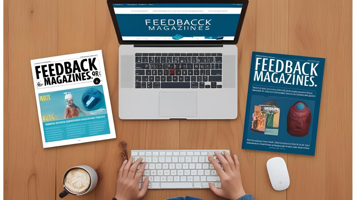
FeedbackMagazines.org/: A Hub for Engaging Content
-
 News9 months ago
Cristian Romero Opens Door to Tottenham Exit as Atletico Madrid Eyes £43 Million Move for Argentina Star
-
 News9 months ago
Nancy Mace Faces Criticism and Support After Heated Exchange With Trans Activist at South Carolina Event
-
 Tech11 months ago
Exploring Eporer: The Digital Revolution You Need to Know
-
 News9 months ago
Passengers From Luxury Rovos Rail Train Thank Zimbabwe for Support as They Arrive in Victoria Falls After Collision Near Gwanda
-
 Crypto11 months ago
CrypticStreet.com Guides: Your Ultimate Resource Hub
-
 Tech11 months ago
Kingxomiz: Unlocking Innovation and Personal Growth